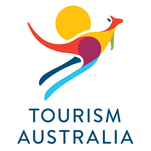
New Tourism Australia logo
2012-12-07 — /travelprnews.com/ — Tourism Australia has today confirmed that it is evolving its current logo, “to stay relevant and to reflect the organisation’s changing culture and identity.”
The new logo will still feature the iconic kangaroo but with a more modern design and vibrant colourful palette reflecting the rich and varied landscape of Australia.
Tourism Australia Managing Director Andrew McEvoy said it was the right time to update the eight year old logo and doing so would complement the recent update to the national tourism organisation’s global campaign.
“Tourism brands the world over, from Australia to Argentina, are continually updating their visual identity. Even New York’s iconic ‘I [heart] NY’ logo was revamped for the city’s recent summer tourism campaign,” Mr McEvoy said.
He said the new logo was more modern, sophisticated and better aligned with the contemporary and ‘best of Australia’ positioning being communicated by Tourism Australia’s recently updated campaign creative.
“While it has powerful visual elements that are still relevant, the current logo itself is beginning to look out-of-step with the next phase of our There’s nothing like Australia campaign,” Mr McEvoy said.
“The strong use of blues, greens and yellows, and a significantly more contemporary positioning, is in keeping with Tourism Australia’s positioning of a modern and confident Australia open to the world,” he said.
The current logo was designed in 2004 at the time of the ‘Different Light’ campaign.
The new logo will be progressively rolled out, starting in Australia and across the Tourism Australia network of 12 international offices from December 17. The timing aligns with Tourism Australia moving into new corporate headquarters at 420 George Street in the Sydney CBD.
Campaign artwork with the new logo will start to be used rolled from 1 January 2013′ with the aim of having the new logo included in all campaign material globally by the end of April 2013.
The creative work has been carried out Interbrand, part of Tourism Australia’s current global creative agency, DDB.
Tourism Australia
Leo Seaton
Media Relations Manager
P. 61 2 9361 1363
E. lseaton@tourism.australia.com
Tourism Australia
Kim Moore
Public Affairs Manager
P. 61 2 9361 1306
E. kmoore@tourism.australia.com
W. http://www.media.australia.com
###
NEW YORK, 2024-Dec-20 — /Travel PR News/ — The holiday season is a magical time… Read More
ANAHEIM, CA, 2024-Dec-20 — /Travel PR News/ — Join us for an exclusive session on Copa… Read More
Worcester, United States, 2024-Dec-20 — /Travel PR News/ — There are times when passengers face situations… Read More
Stunning scenery and world-class fishing have put Iceland at the top of many anglers’… Read More
ANAHEIM, CA, 2024-12-19 — /Travel PR News/ — Traveling can be one of life’s greatest… Read More
Privilege Club members can now convert their Avios to Marriott Bonvoy points at a two… Read More
This website uses cookies.